The online store of CBD products from the Swiss market had to refresh its branding since the existing visual identity was not attractive nor recognizable enough, and the logo was not in line with the policy of most advertising platforms.
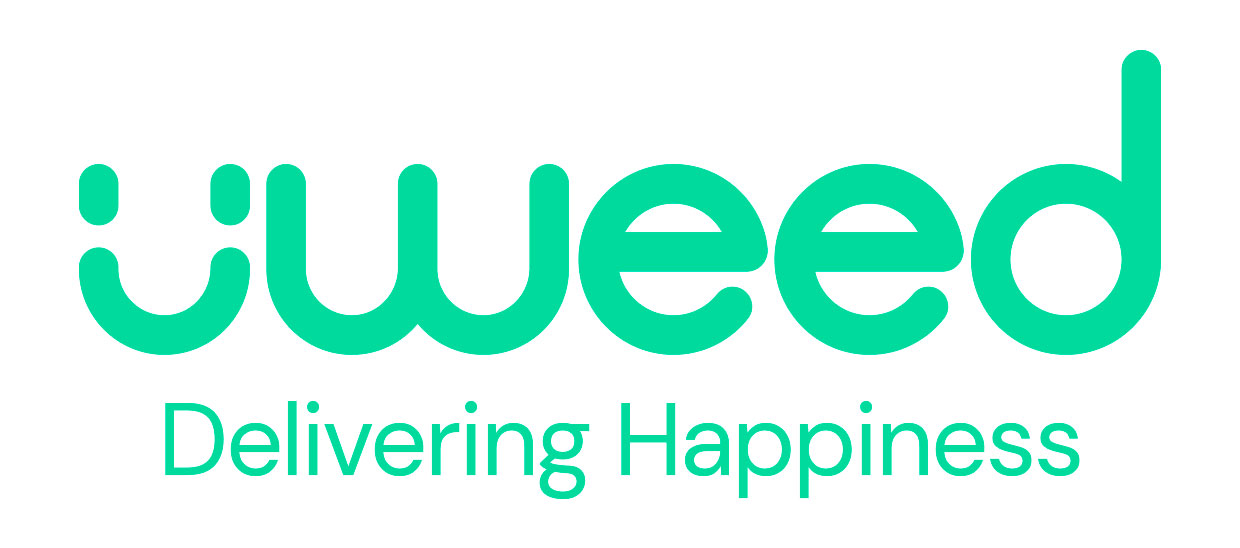
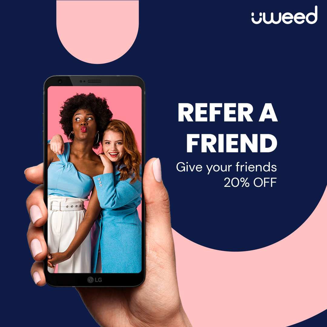
Refreshing the visual identity had to be accompanied by a new creative concept and slogan – “Delivering happiness”, which reflects the uWeed brand values and philosophy.
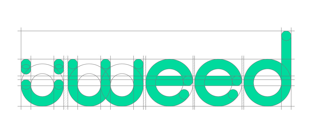
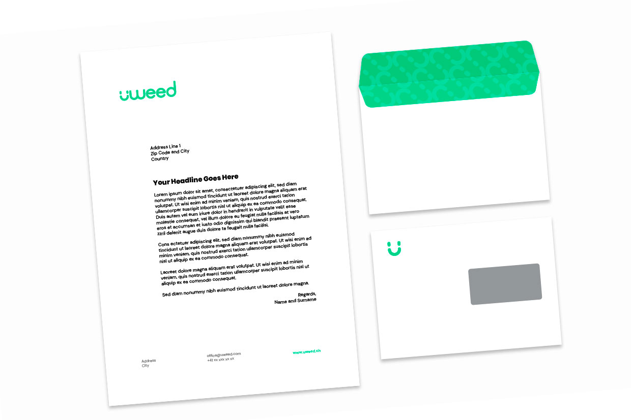
Logo
We decided to insert the letter “U” from the brand name (uWeed) into an emoticon – a smiley, which is a universal symbol of happiness.
It consists of straight lines and circles, and can easily be recreated from these elements.
From the technical side, the new logo is easy to apply and modern.
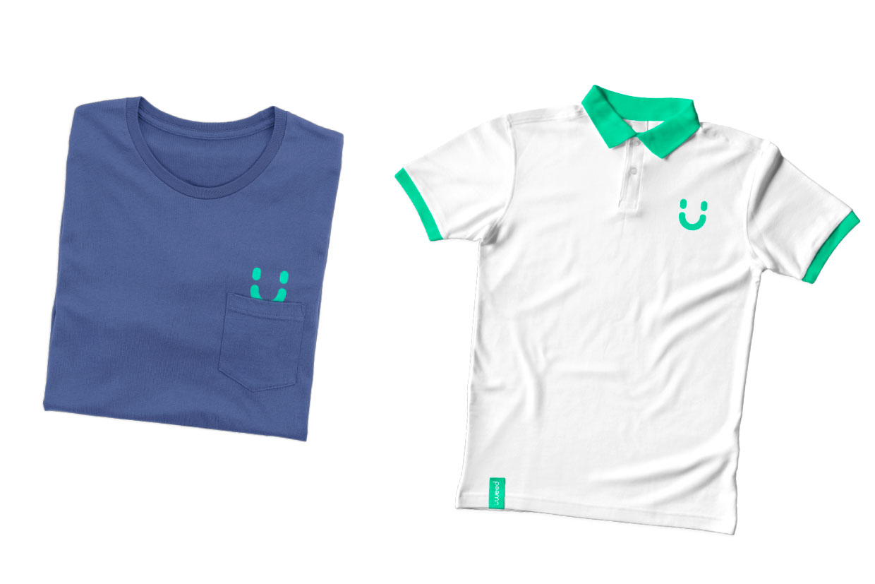
Pattern
A sign derived from a logo can also be easily used as an element in online applications and printed materials
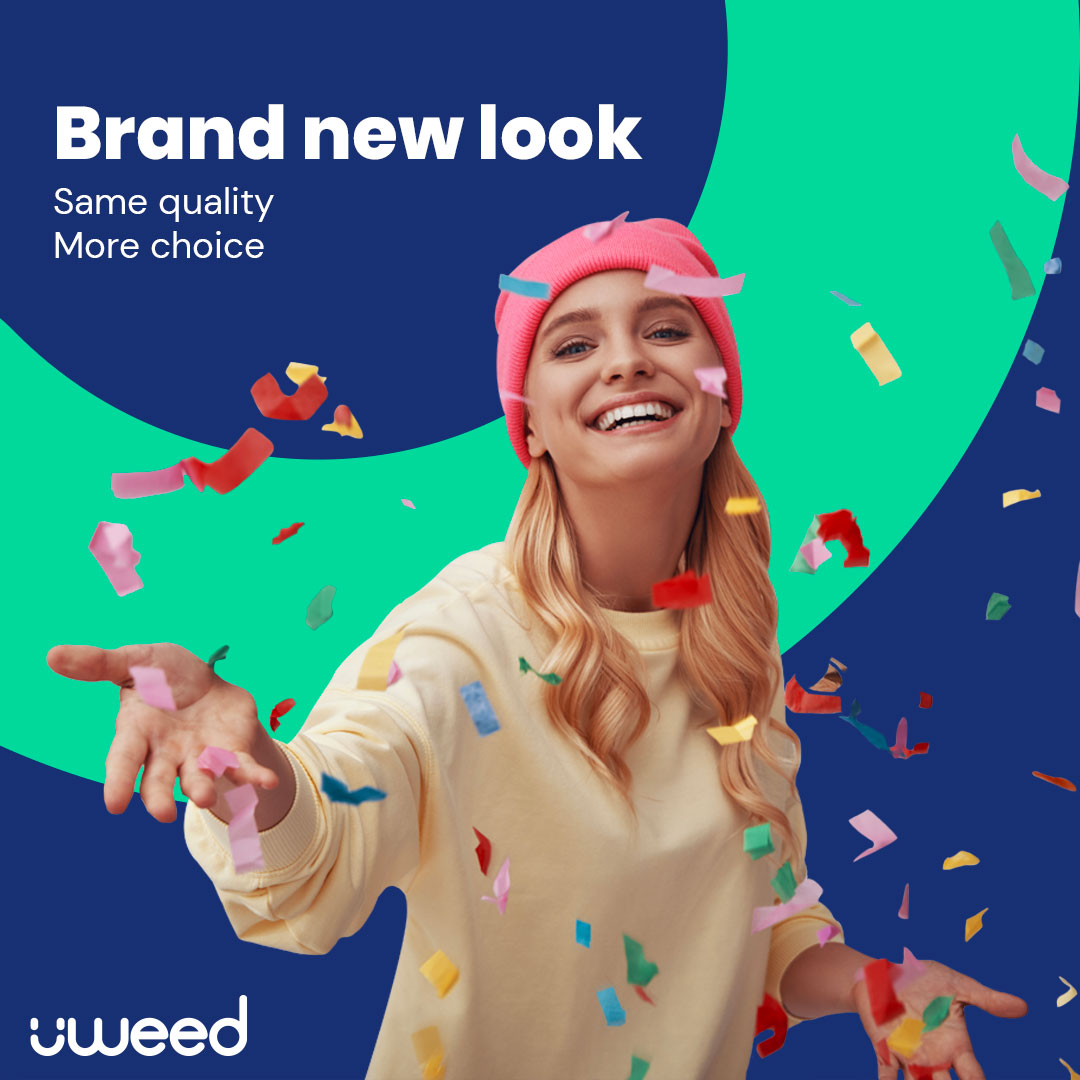
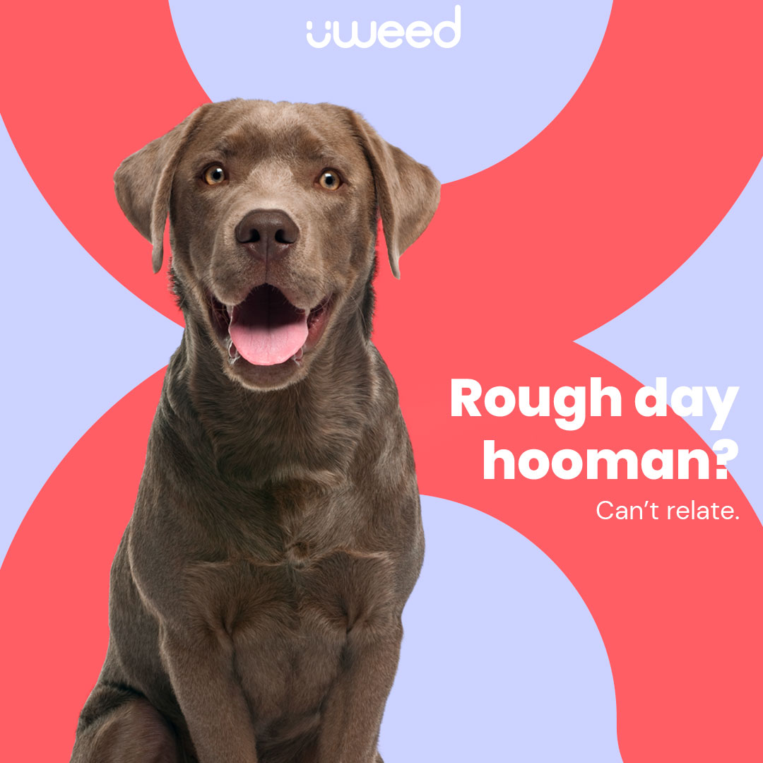
Color Palette
The colour palette consists of seven vibrant colours with high contrast, to give customers a sense of joy.
The colour names are inspired by cannabis strains, with Northern Lights as the primary colour.
Typography
We chose two legible and transparent sans serif fonts in order to create a feeling of pleasantness and functionality and thus additionally motivate customers to return to the Uweed product and website.