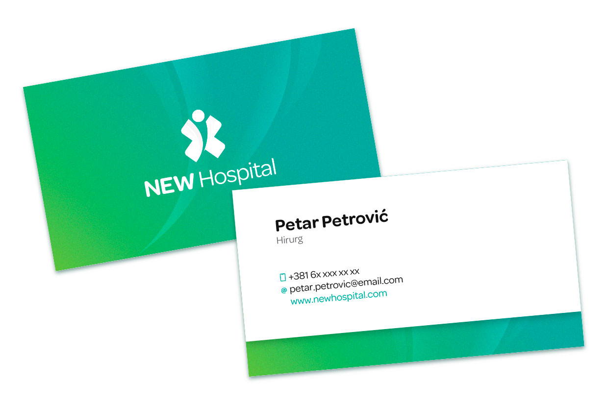
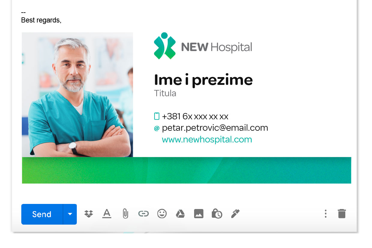
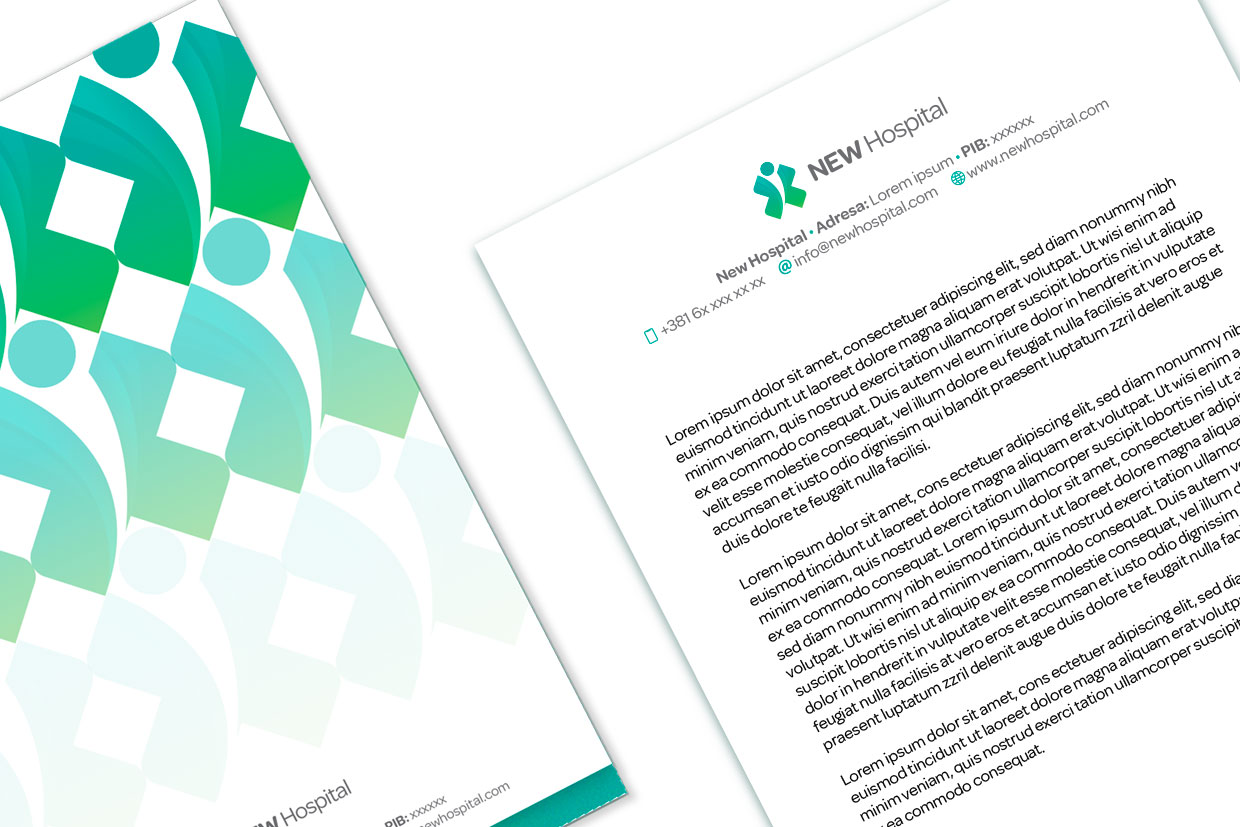
Since the client was the most modern general hospital in the region, it was necessary to develop the complete visual identity of the new private hospital under the name – NEW Hospital.
The goal was to communicate through branding both state-of-the-art equipment and expertise, as well as authenticity in a caring and dedicated approach to each patient.
Logo
We created a logo that was inspired by the most universal medical symbol – the cross, which we adapted in an authentic and elegant way.
From the perspective of form, the cross resembles a butterfly that symbolizes life, hope and rapid transformation. At the same time, associating with a man with outstretched hands – has a double symbolism – it represents the one who asks, but also the one who provides help.
Color palette
The colour palette consists of special shades of green, which symbolically denote health and well-being.
The secondary colours are black, white and grey.
The gradient can also be used as a separate graphic element, made up of a combination of Tea and Leaf colours.
Tipography
Carefully chosen typography matches the brand’s values. The OMNES font looks very professional, while at the same time giving off a very positive and friendly impression with its rounded edges.